




Austin’s leaders just spent $1.1 million and seven years on a new city rebrand — and the result has Texans howling with laughter.
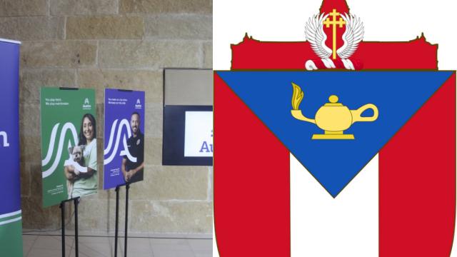
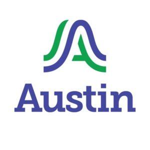
The capital city, once proud of a seal that reflected Texas’ history and faith, has replaced it with what critics say looks like a half-baked doodle. Designed by a firm literally called Pentagram (you can’t make this up), the new logo ditches heritage for a generic “A”-shaped swoosh that supposedly represents hills and bridges.
The old seal, adopted in the early 20th century, carried meaning and history: red, white, and blue colors to reflect Texas and America, a cross with angelic wings pulled from Stephen Austin’s family crest as a reminder of the city’s Christian roots, and the state capitol itself as a backdrop to signify Austin’s role in Texas government.

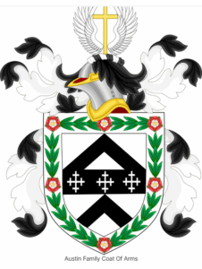
Now? All of that’s gone — replaced by what looks like a corporate sketch. One Austin lawyer summed up the mood: “That’s not a logo. That’s a bad inside joke.”
The backlash has been brutal. “Completely expected,” admitted the design firm’s partner, as if knowing taxpayers would revolt. Even Cracker Barrel’s much-mocked “woke” branding attempts are now being used as the butt of comparisons — and Cracker Barrel’s coming out looking smart next to Austin’s million-dollar “Keep Austin Weird” swoosh.
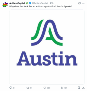
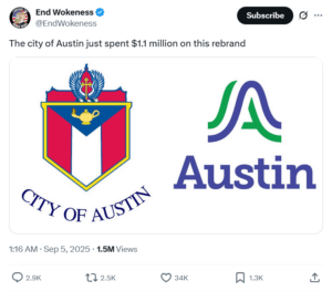
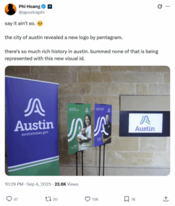
Residents online are blasting the project for being nothing more than a taxpayer-funded vanity play that erases the city’s founding symbols in favor of bland corporate nonsense. And the kicker? It took seven years to come up with it.
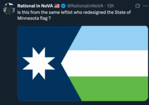
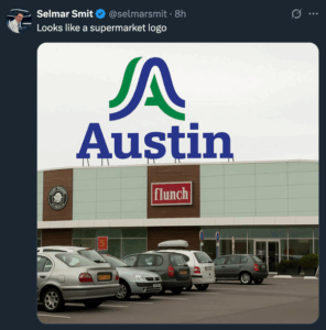






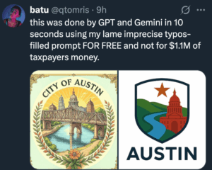
Welcome to Austin, where $1 million buys you a logo nobody likes, a backlash everyone saw coming, and another chapter in the city’s ongoing effort to out-weird itself — this time at taxpayers’ expense.